Pistachio AS
Cyber Invaders
Can Fun and Games Boost CTA?
We know from consumer behavior studies that people don’t buy products—we buy stories and emotions.
Yet, keeping visitors engaged on a website is harder than ever. According to Nielsen Norman Group (2011), people often scan web content very quick and spend as little as 0.5 seconds on things they dont immediately find interesting. I’ve felt this frustration myself—searching for the right solution often feels uninspiring. Many websites look nearly identical, just with a different color pallette. They lack the wow factor and the trust needed to turn visitors into customers.
But what if we changed that? What if we gave people more than just something to read—what if we gave them something to experience? What if we transformed static content into interactive, story-driven content that communicate both the problem and the solution—clearly? Could this lead to higher CTA rates?
I based the idea on Pistachioapp.com, a cybersecurity training platform that uses attack simulations to teach businesses and employees how to stay safe online. Cybersecurity is the perfect challenge: a niche industry, full of technical language, abstract risks, and a reputation for being… well, dry—to some people.
To make people stay, they first need to understand—and to understand, they need to care. That means speaking their language and creating visual clarity. And perhaps most importantly: making the content memorable.
So I introduce a break from the static.
A way of telling information in creative, digestible manners.
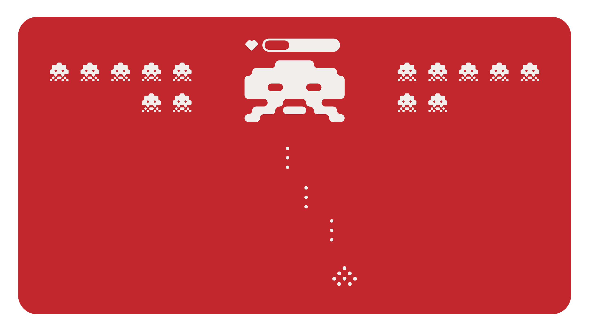
Cyber Invaders: a nostalgic childhood arcade game, reimagined through Pistachio’s brand identity. The result? An interactive web experience that turns abstract cyber threats into something instantly graspable—and even fun.
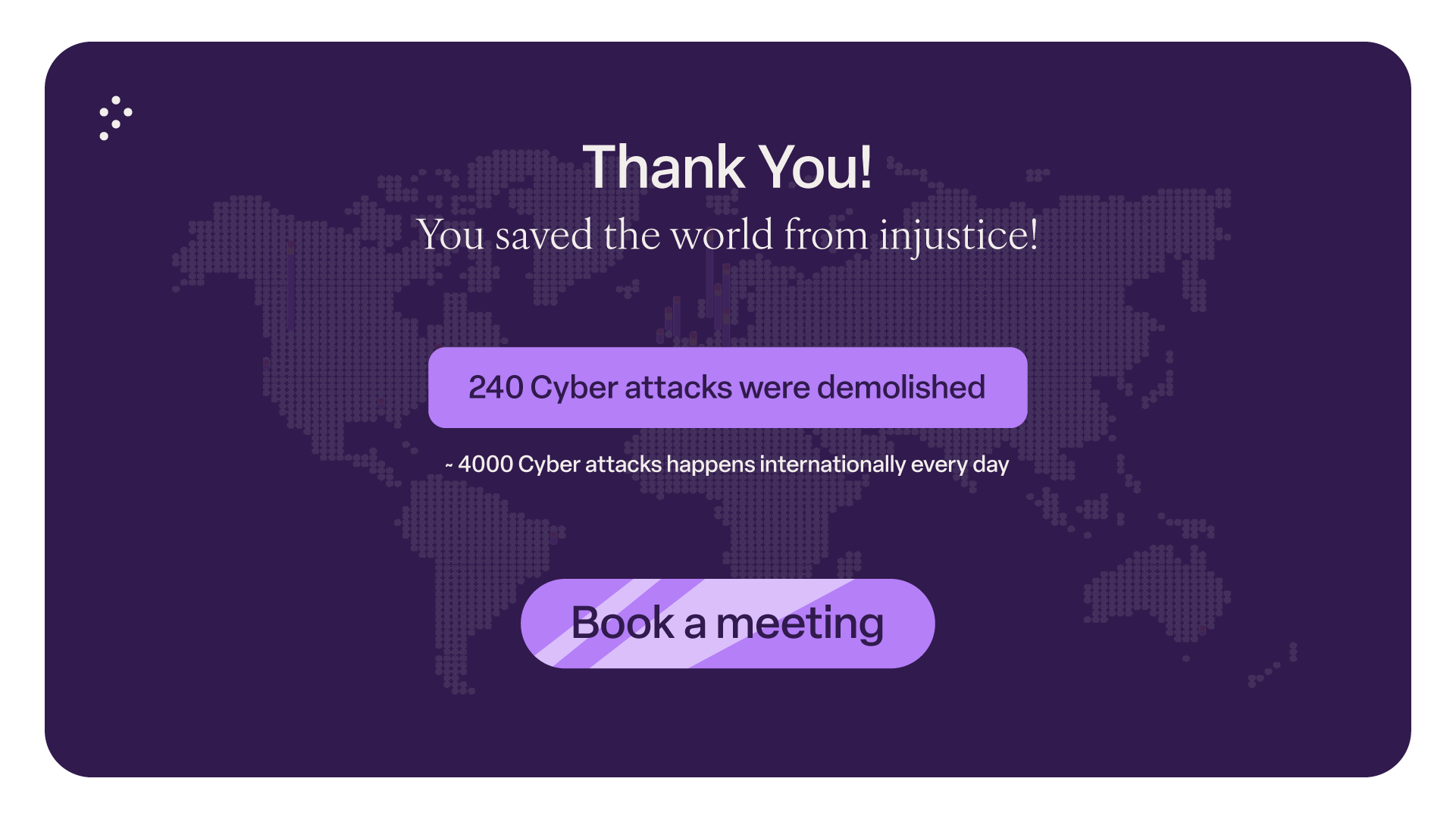
The game is short and clear—the goal is to defend your hardware from cyber threats. At the end, the player learns just how common these threats are and is presented with a CTA button leading to a customer meeting about Pistachio’s services and plans.
So, is it possible to fully control attention through carefully crafted storytelling and interactive design?
That’s the question this case study begins to explore—and it’s one I believe holds the key to how we communicate in the next era of digital experiences.
Elements: Illustrator and Photoshop
Animation: After effects
Bike freedom
Oslo Bysykkel
-
The public city bikes in Oslo are used daily by thousands of citizens and is placed all over the city.
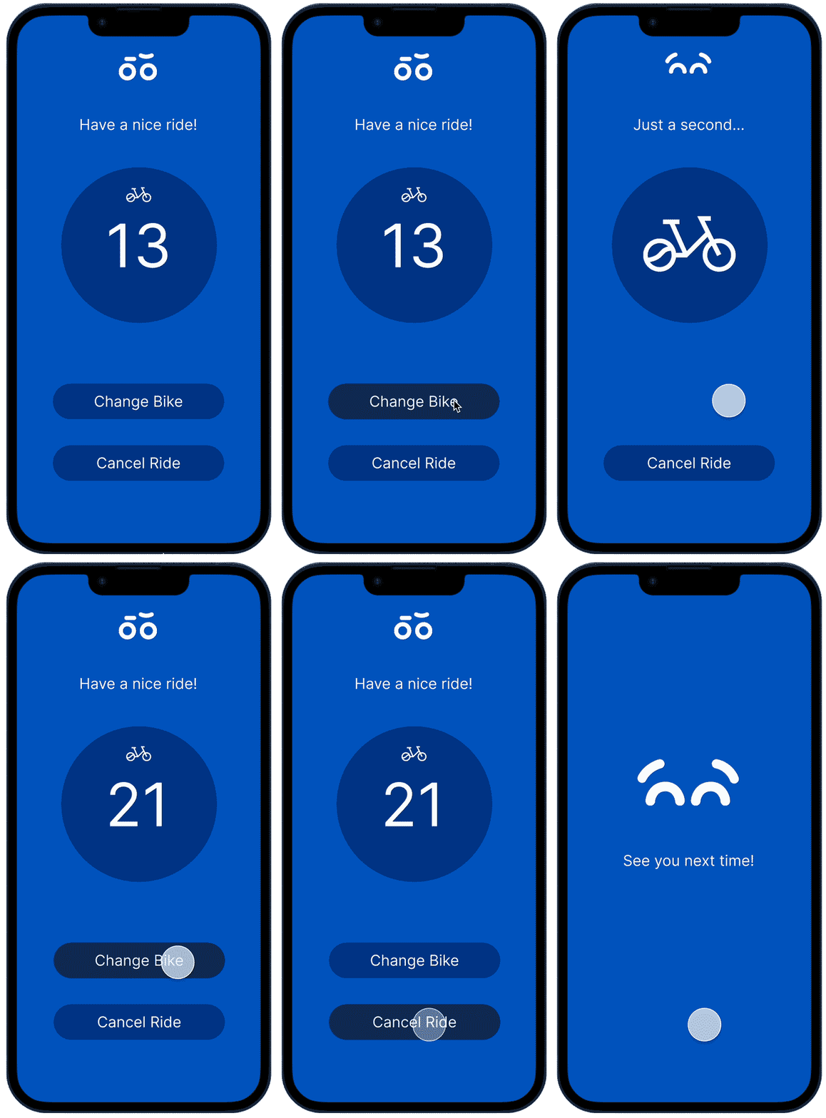
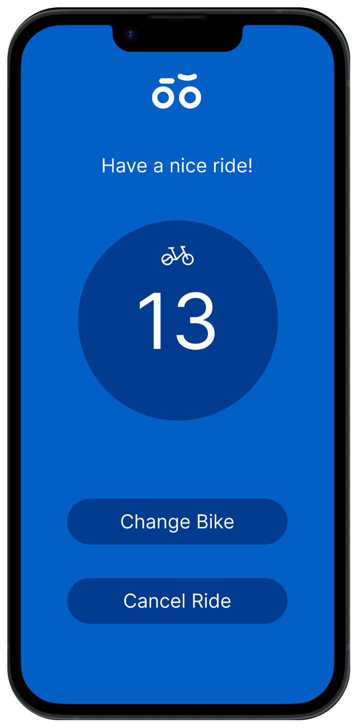
the bikes are approachable with an application that gives you a map view with the nearest bikes, how many bikes and parkings available. The application choose a random bike number from the selected dock. The user then have to find the respective number, pull it out and ride.
The bike quality differs from uncomfortable, decent and good alternative for transportation.
The bad bikes leads to uncomfortable and unfortunate experiences that can become dangerous in the traffic picture.
Today there is no easy task to change bike or cancel the ride before taking the given bike out of the dock and put it back in the parking, and then wait for the application to sync and get another random bike that’s hopefully better.
-
Citizens using the city bikes service needs an easier way to change and cancel bike rides to gain more effective usage and safety when riding.
-
I made a prototype that let’s users change bikes and cancel rides to delete the frustration of bike experiences leading to dangerous traffic situations and also miss clicks in hectic environments giving the users a more seamless experience with the first step of the user flow.
Elements: Illustrator
Prototype: Figma
Animation: Photoshop
Designinstituttet AS
Student map
-
Moving to a new place can be challenging for students. The limited time between receiving an acceptance letter and starting classes leaves little room for finding suitable accommodation and get comfortable.
Moreover, being away from familiar surroundings and a support network can lead to feelings of isolation and homesickness. Students might struggle to establish a social circle and integrate into the local community.
-
How can we as a school make the transformation easier for the students
-
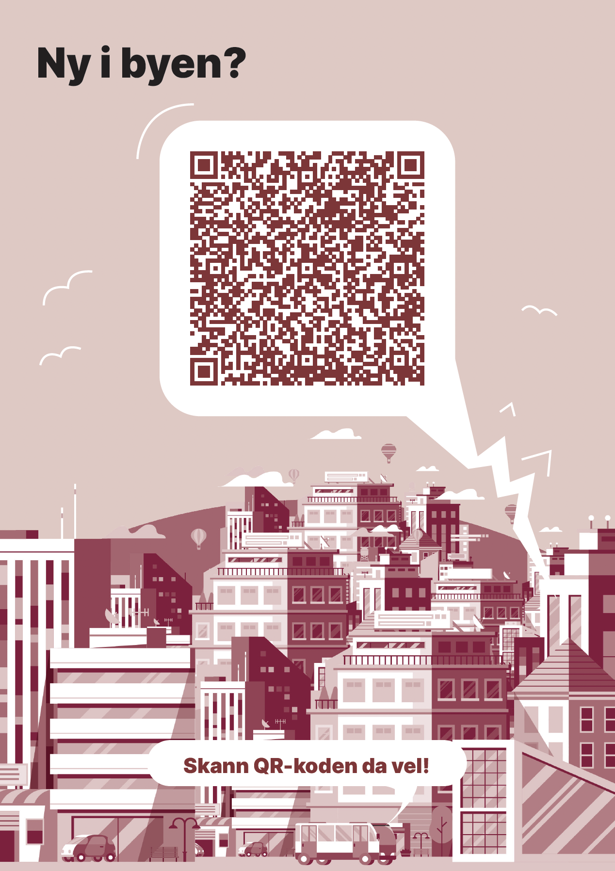
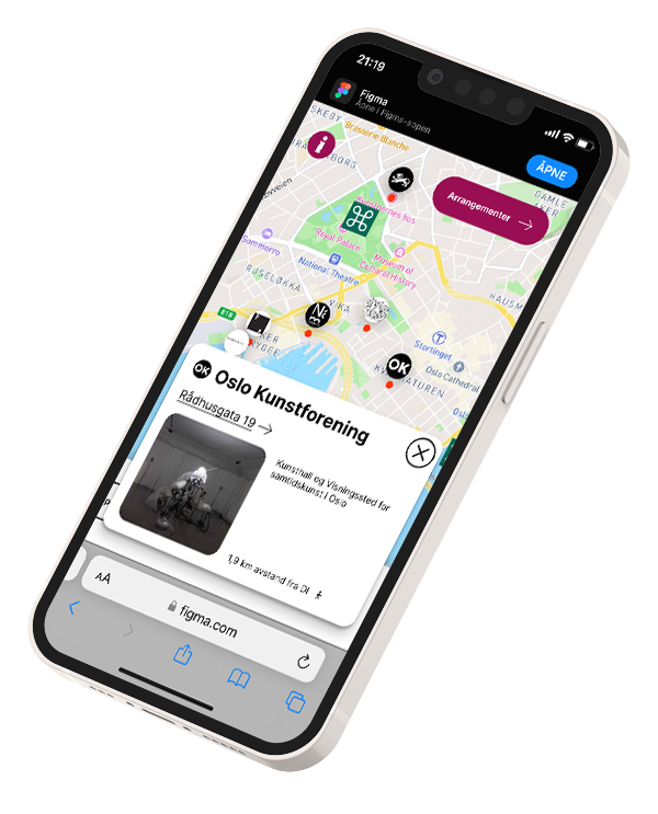
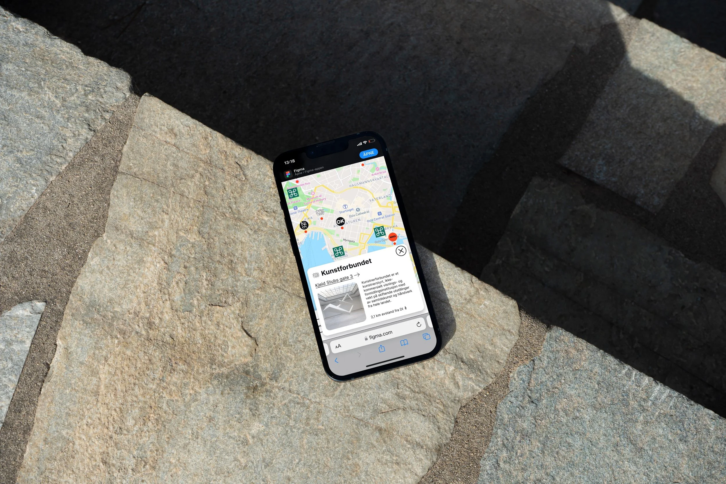
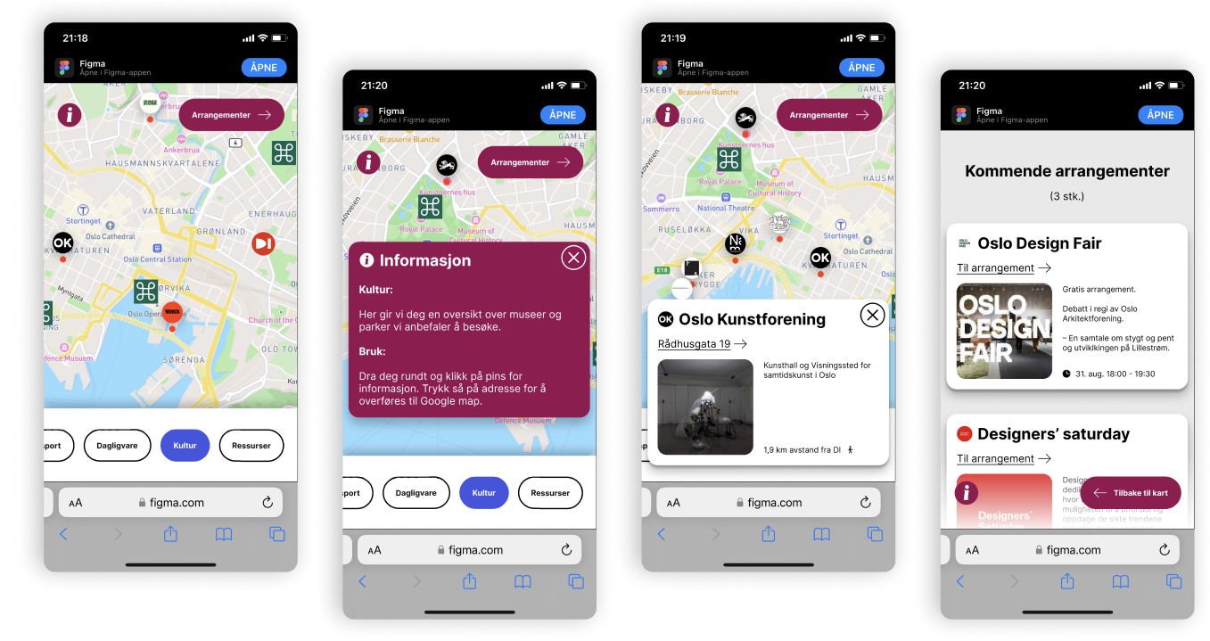
To make the transformation easier for the students far away I made a high fidelity prototype with pinned locations.
We pinned our best recommended places to visit for art, design, architecture and happenings –as well as transportation and grocery stores near the school.

